
Apple Agent Toolbox UI Redesign
Client:
Apple
Role:
Product Designer
Project Summary:
Re-design Apple’s internal application to process orders and returns. Our team consisted of a highly collaborative effort between project manager, UX lead, Creative Director, and Visual Designer. We focused first on the user flow for item cancellations, knowing that this is a common action that agents need to perform on a regular basis. The extended flow will be based on the selected experience direction from our approaches.
Reasons for Updating
The overall experience is:
Overwhelming and unrestrained display of information and options.
Less than intuitive and difficult to easily find information, determining actions, and navigating through experience
Ineffective use of space, with unused real estate. Small side panes, and always visible icons / confusing buttons
The design hadn’t been updated for over a decade
Existing UI Design
Inspiration // Tool Exploration
We sought out inspiration through other interfaces such as Magento, Shopify, and Salesforce. We noticed common successes and failures within each to inform our conversation with stakeholders.

Example wireframes
Based on research and exploration by our UX strategist, we were able to solidify approved wireframe experiences that simplified menus, icons, order details, and alerts, resulting in clearer navigation and more intuitive interactions.

Visual Design Overview
The Apple brand is clean and unobtrusive, favoring simplicity and clarity. Using Apple design systems, we crafted a custom experience initially presented in light mode with carefully chosen hints of color, each applied with deliberate intent. When the user logs in, they are greeted and welcomed back, invited to begin a high-level search. We rely on primary blue to guide the journey through clear, actionable elements. System statuses are indicated by distinct shades of orange, yellow, and green to convey state at a glance.
Menu(s)
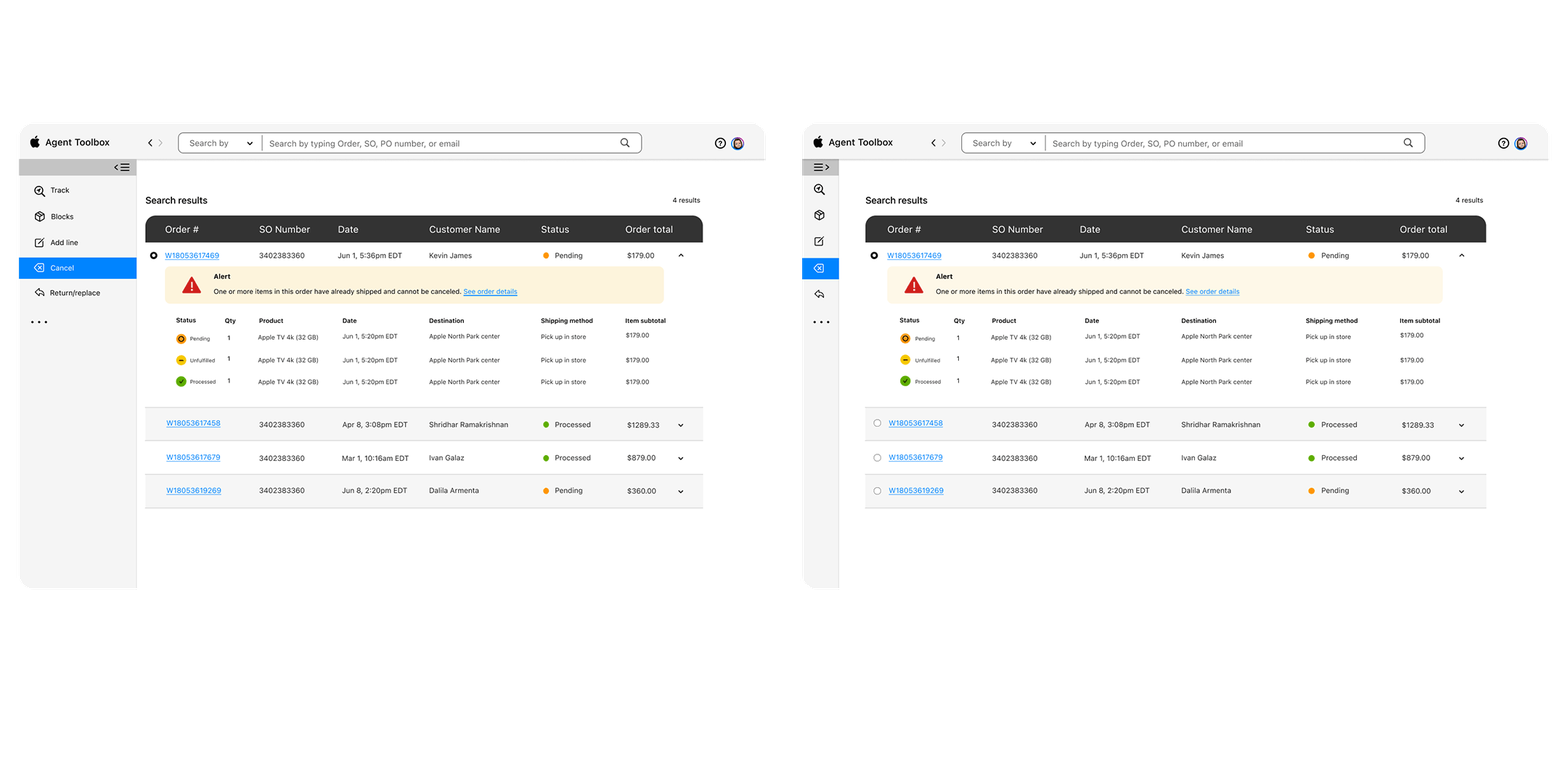
We built our final design around an expanded side-bar menu. We updated the icons so they clearly represent each task. The side bar will appear at every step of the experience without impeding the workflow, and users can choose to expand or collapse it to create additional space for processing orders.
