Transforming Microsoft Azure’s new brand for it’s global web presence.
The ask:
We were asked to adapt Azure’s new visual identity to Microsoft’s digital web design system, emphasizing the “Building in Public” design principles—immersion, authenticity, and forward thinking.Role:
Senior Visual DesignerTimeline:
3 monthsTools:
Figma, AEM, Gradial
The Challenge
Build a cohesive, extensive library of UI components, content blades, and rule sets with clear guidelines.
Scale the Azure brand to achieve a consistent, universal look and feel that remains true to the brand’s original identity.
Replace existing live pages in a streamlined, efficient manner while minimizing disruption.
Develop strategic design systems that can be easily ingested by the AI tool Gradial to speed up production and reliably meet deadline goals.
Objectives
Create a single source of truth: stylized image borders, background elements, incorporating key brand art, hero styles, and more.
Preserve brand equity: ensure updates honor Azure’s visual language, tone, and accessibility standards.
Minimize live-site risk: phased rollout, feature flags, and rollback procedures.
Enable AI-driven execution: deliver formats Gradial requires for automated asset generation and page assembly.
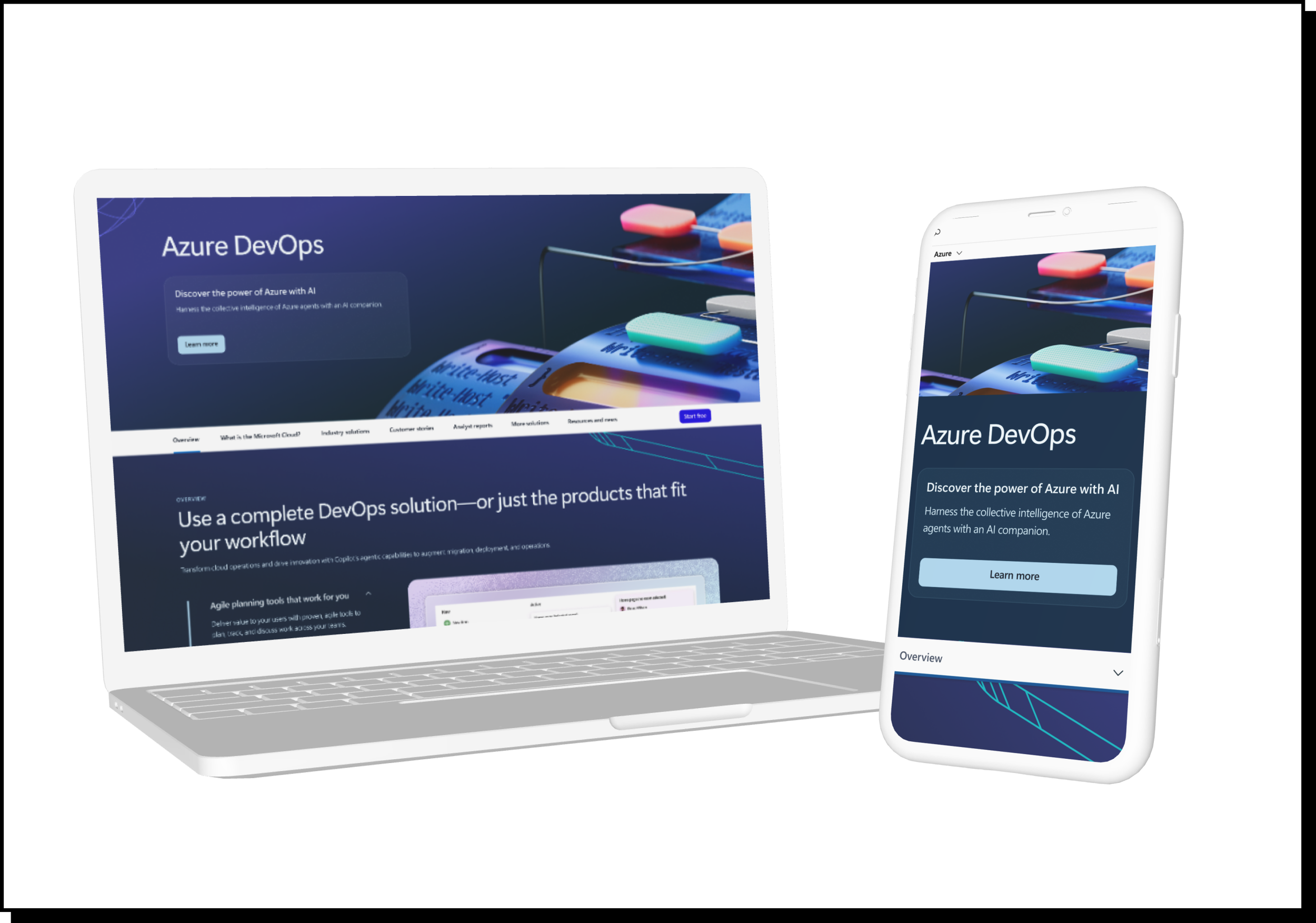
Example Execution:
Defining patterns and connections:
We organized pages into four categories based on core sets of 3D scene illustrations. From those foundations, design elements expand progressively down the page to align with the corresponding color patterns.
Example execution–AI platform fuchsia theme:
Here is an example layout for the Azure Copilot product description page, designed to align with the AI Platform’s fuchsia theme. The page flow uses design elements to frame the content in a way that feels engaging without becoming distracting, helping maintain reader attention throughout the experience. To sustain visual interest—especially across longer-form content—the graphics gradually transition from wireframe-style visuals to more immersive 3D elements about halfway down the page.
Variations:
Designed for both light mode and dark mode:
Each page is carefully curated with the intended audience in mind, ensuring that the design, tone, and overall experience align with user expectations and behaviors. For example, when the audience is more technical—such as developers, engineers, or IT decision-makers—a dark mode interface often feels more intuitive and appropriate. It reflects the visual environments these users are accustomed to working in and can help create a more modern, focused, and technically sophisticated experience.
By tailoring the design approach to each audience segment, the experience becomes more engaging, relevant, and effective.
Example dark mode layouts